Designer Showcase|Kitchen Design

Emma Chamberlain Selects Waterstone Faucets for Kitchen Featured in Architectural Digest

We at Waterstone are absolutely thrilled that Emma Chamberlain chose two Waterstone Faucet products for her new kitchen. Emma’s exquisite new Los Angeles home is the main feature in November’s issue of Architectural Digest, and the subject of a standout episode of AD’s Open Door video series.  Entrepreneur, Louis Vuitton ambassador, and popular social media influencer, Chamberlain selected our Industrial PLP Faucet, Industrial Hot and Cold Filtration Faucet, Industrial Dual Port Air Gap and Industrial Soap/Lotion dispenser for her kitchen sink. The Polished Copper fixtures stun atop the soft green swirls of the stone countertop. The Industrial Wall Mounted Pot Filler, also in Polished Copper shines against a pale green tile backsplash. As she gives viewers a video tour of her home, Emma mentions that she’s always dreamed of one day owning a pot filler, so we are honored to provide one that is endlessly dependable and adheres beautifully to the brilliant aesthetic.   This organic-modern kitchen is an unforgettable space juxtaposing warm metallic and wooden accents against a sea of pale greens and neutrals. Photographer Christopher Sturman beautifully captures the space that feels both effortless and lavish. Waterstone Faucets’ craftsmanship and meticulous hand finishing means our products stand out in any setting. But this design by Proem Studio, is the stuff of kitchen dreams.   The November issue of Architectural Digest is available now in both print and digital formats!

Emma Chamberlain Selects Waterstone Faucets for Kitchen Featured in Architectural Digest Read Post »

A Bold Take On a ‘Luxurious Farmhouse’ Design: See the Winning Kitchen in Our Design Contest’s Contemporary Category

Our first Waterstone Design Contest has wrapped up, and we’re proud to put a spotlight on the inaugural Contemporary Kitchen category winner, By Design Interiors, Inc. Featuring a bold (and unexpected) combination of opulent luxury and modern farmhouse styles, the kitchen has been called the “Chanel Chic” renovation. Contest judge Cara Fox, principal designer at the Fox Group, described the space as having “a stunning wow factor with gorgeous statement marble that is full of personality and beauty… brass and modern lighting complements and freshens the whole room.” The design team at By Design Interiors joined us to discuss exactly how they incorporated glitz and glamour into this winning contemporary kitchen design. 1. When designing a space with a dynamic combination of colors and materials like this one, where do you start? For this ‘Chanel Chic Kitchen’ – The designer wanted to update the home to beautifully match the fabulous and chic personal style of the homeowner. As a high-profile professional, the homeowner wanted a dramatic space in the ‘heart’ of her home to entertain guests. Together, they created a sleek, black, white, and gold oasis that truly grabs your attention. 2. Is this kitchen representative of your usual style or does it stand out against your other work? By Design Interiors, Inc. is a hub for talented designers to work with homeowners in creating interior spaces as unique as each client. All our designers can take on different design styles, we are chameleons in that sense, yet we do certain styles and aesthetics we are drawn to. For our Chanel Chic Renovation, we wanted to highlight the homeowners’ love for glamour paired with modern farmhouse design elements. Mixing in bold black, white, and gold with pops of turquoise, durable surfaces (such as the shiplap along the grand island), and exposed beams seen in the great room. It was a hands-on process between the designer and homeowner, beginning with discussing inspiration images and getting to know her personal style. From there we were able to begin the selections process. In this case, the plumbing fixtures were selected very early in the design process. This helped to learn: What metal finishes do they like? Are they more modern or traditional? Do they like square lines or curvy lines? Are they ok with mixing metal finishes? Do they love to cook? Do they love to entertain? Once plumbing and appliances are finalized, the design team can move forward with so many other selections for the space keeping the shapes, finishes, and style consistent throughout. 3. There are many eye-catching pieces in this kitchen, but which would you say is your favorite? Oh, so many! We love how this kitchen embodies the homeowner perfectly! From the gold vent hood to the black tiles and striking Cambria quartz waterfall edge island…but we can’t deny that the island is showstopper! It was a favorite selection for the homeowner, and your eye goes straight there upon entering the space. The matte black sleek Waterstone faucet compliments it perfectly. 4. What kind of vibe does the black, white, and gold combination make for in this space? Drama. The space utilizes the client’s personal / high-end style as the muse behind the glamours of golds, black and whites. The homeowner wanted her kitchen to make a statement for her guests. She loves to entertain and wanted this space to have the ‘Wow-Factor’ for all who enter. The bold contrast of the white cabinets, black backsplash and gold vent hood is pure drama! It encompasses the glamour while still being function by utilizing high-quality appliances durable materials such as quartz and porcelain. 5. It almost looks as if the room was designed around the Waterstone PLP faucet. What drew you to the faucet and this finish in particular? The matte black and brass Waterstone Pulldown faucet perfectly complements the island design, adding an edgy industrial pop to the glamourous quartz countertop. 6. What would you say is the most important aspect of designing a kitchen? It is important to design a kitchen that is functional for the homeowner. This begins by gathering inspiration, listening, and learning about what they love, their lifestyle and how they plan to live / use their home. We consider: do they like to cook? Entertain? Lifestyle? Professions? Etc. It’s important to understand how their daily routines will be throughout the space. From there, we are able to create the best workflow and begin to make selections for their needs and style. We enjoy creating spaces that look like the client really belongs in them. The end goal is for friends, family, even acquaintances to walk into a client’s space and say “oh! This is so you!” For our Chanel Chic Kitchen, it was about showing off the client’s personal style by incorporating glitz and glamour with a striking black, white, and gold color palette accented by gold bamboo-look pendants, bold hardware, and decorative brass details on the apron-front sink, Waterstone faucet, and JennAir range. The hard surfaces were selected to fit the homeowner’s busy lifestyle – as a successful professional with a passion for dogs – each surface is cleanable, puppy-proof, yet luxurious. The star is the Cambria Quartz island top in the Bentley design. It directed every selection and detail of the space. The dynamic black and white veining and waterfall edge is supported by glossy black chevron backsplash, chic black and white cabinetry, and a gold-leafed custom vent hood. Instead of a standard door, a custom designed ‘Greek-key’- inspired swinging door leads into the working pantry. Subtle white shiplap panels line the back of the island for an extra level of durability when sitting at this grand island. 7. It looks like the owners will enjoy this space for years to come. How do you balance creating bold designs with making sure they remain timeless? We balance bold designs with function. This is done by getting to know our client and making sure the selections and designs will not only be

A Bold Take On a ‘Luxurious Farmhouse’ Design: See the Winning Kitchen in Our Design Contest’s Contemporary Category Read Post »

A Q&A with a Design Contest Winner on Transforming a Century-Old Kitchen

Renovating the kitchen inside a historic home is bound to have its challenges – especially when it’s been vacant for over 30 years. Winner of our Design Contest’s Traditional Kitchen category, interior designer Lindsey Snodgrass of Golden Key Designs worked on a 1905 Greek Revival home in New Orleans, Louisiana, and completed its new kitchen to seamlessly blend in with its surrounding architecture. A master class in tasteful restoration, the kitchen maintains the character of the original home while modernizing the space for 21st-century life. Waterstone Design Contest judge Cara Fox of The Fox Group described the winning design as a “[combination of] timeless and classic style with a hint of modern luxury and convenience. It’s elegant and the use of materials is perfectly balanced.” We spoke to the designer on how exactly she married the old with the new through careful material and fixture choices. 1. You said this 1905 home had been vacant for over 30 years – what was the home and old kitchen like before the renovation? The kitchen was definitely the number one area that needed care. It had a lot of termite damage. The ceiling had water intrusion problems and the cabinets were crumbling apart. On our first visit, there were even a couple squirrels in the ceiling! The original exterior of the kitchen was very small and closed off from the rest of the house. The upstairs sun porch was actually falling down due to termite damage. The best option was to demo both and expand the kitchen across the entire width of the house. This allowed the kitchen to be much more open and functional for today’s lifestyle. It also allowed us to create a beautiful floor plan upstairs that added a primary suite. 2. What were the challenges in designing the new kitchen and how did you overcome them to meet the design goals? Our biggest goal was to carry the historical aspects throughout the new addition. We wanted it to be a seamless transition, and feel like it was always part of the home. The biggest challenge with this kitchen was probably the flooring. This doesn’t seem like a very fabulous aspect of the design, but to have the old floor tie seamlessly into the new, without a threshold or 1/2’’ rise was so important. I think how a floor transitions from one room to another, especially when it’s an addition, can dramatically make a difference in the overall flow and feeling of the space. This was a raised home, which is very common in New Orleans, so it wasn’t as simple as laying a traditional foundation. To perfectly match the height of the original wood floors to the new flooring was a challenge. It was 100-year-old brick piers with rough cut wood sills and true 1’’ thick wood floors with no subfloor. Calculating it to match the exact height for new grade beams, with lumber that isn’t true to size as it used to be, adding subfloor and accounting for the thickness of modern long leaf pine floor boards was harder than it seems. Plus, most historical homes can easily be an inch off, over the entire width of the foundation that you’re tying into, so we had to account for that as well. It was a lot! I strongly believe it’s those details that make a difference in the outcome. 3. How would you describe the new kitchen’s style? I would say it’s a modern twist on French country. 4. How did you balance maintaining the character of the old kitchen and modernizing it? Did the homeowners have specific requests on what to keep, or what to buy new? Since this kitchen was almost completely new construction, we had to design the coffered ceiling, the trim work, the kitchen windows, everything from scratch and ensure it flowed with the rest of the home. It was important to keep and reuse as many of the old elements as we could. There was a total of six doorways with transoms that were removed and reused throughout the home. You can see the original wood door in the kitchen, it used to lead outside, but now it leads into the laundry room. We kept the same angle of the doorway to match how it originally was leading into the kitchen, except it’s about 10’ over after widening the room. You don’t see it in these photos, but the living room doorway mimics the same angle, so we felt it was an important architectural aspect to keep. Once we had the historical aspects finalized we were then able to add in the modern elements. The beautiful Paonazzo marble, the recessed panel on the island waterfall is probably one of my favorite elements. I think that was the perfect blend between modern and traditional. We also mixed new light fixtures with old ones. I am a big fan of Ralph Lauren’s line through Visual Comfort. The McCarren sconces modernized the lighting and complimented the vintage pendants perfectly. Then the custom stove really tied it all together in a perfect way. 5. The Waterstone Extended Reach Faucet fits so naturally into the space. How did you decide on this faucet and what does it contribute to the kitchen’s design? This kitchen needed a faucet that could be a feature all on its own. The extended reach couldn’t have looked better, the classic design went perfectly with this kitchen. Plus, it was honestly a must for the functionality of the 45’’ workstation sink. 6. Why did you decide to go with our Polished Nickel finish for this space? One of my go-to’s for historic homes is polished nickel. It’s just timeless to me. A fun fact is that nickel was the preferred finish in homes from about 1880-1930. I love the understated warmth it brings to a space. 7. How does the classic design of this kitchen relate to other kitchens you’ve worked on? Do you usually design historic homes or is this one

A Q&A with a Design Contest Winner on Transforming a Century-Old Kitchen Read Post »

Artem Chigvintsev’s Los Angeles Home and Kitchen Remodel

Artem Chigvintsev is a professional dancer and choreographer known well from television shows like Dancing with the Stars (which he just won), So You Think You Can Dance and Strictly Come Dancing. Last year he completed the renovation of his kitchen, an open-concept design that now includes our Satin Brass Gantry and Towson Prep Faucet, which he calls “pieces of jewelry.” Artem describes the kitchen as “the heart of the house and the place for entertainment,” and requested a big waterfall island and open shelving rather than cabinets to make the room feel more spacious. While Artem found his old kitchen to be outdated and not his style, the new space is modern and elegant, boasting a luxurious blend of white and grey tile, marble countertops and brass details. The color palette combined with brassy hardware accents is an aesthetic that flows throughout the rest of the home as well. As an avid cook, Artem describes the oven, stove and faucets as the kitchen’s most-used features and advises other kitchen renovators to commit to researching quality products before buying.

Artem Chigvintsev’s Los Angeles Home and Kitchen Remodel Read Post »

Behind the Scenes of This Year’s Atlanta Holiday Home with Designer Janie Wilburn

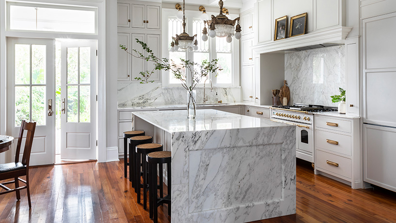
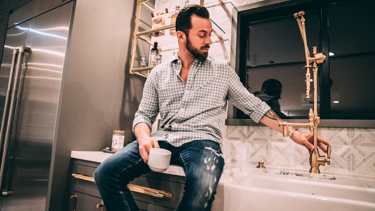
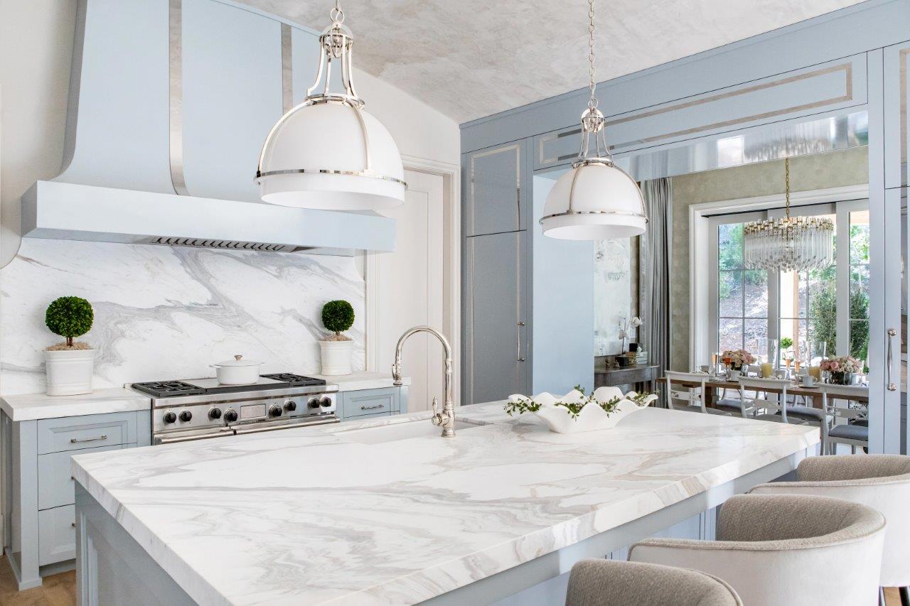
This year’s Home for the Holidays Designer Showhouse is the ultimate display of festive design. The showcase home’s spec designer Janie Wilburn joined us to discuss her experience designing the kitchen and breakfast room in her first holiday house, a classic shingle-style Nantucket cottage in Atlanta, Georgia. What was your role in this year’s Atlanta Holiday Home? Have you been a part of this showhouse before? I was the spec designer for the entire house, which means I was involved from the beginning stages when we first sat down with the architects to plan the whole house. When you get the team together at the very beginning it’s a much more cohesive process. I selected all of the hard finishes for the house — doors, door hardware, floors, wall treatments, cabinets (concept, style, finish, hardware), tile, plumbing, lighting, fire place surrounds, counters, etc.! This is the first time I’ve done a holiday house, so that made it extra fun — kind of like my own personal Christmas gift! Image Credit: CatMax Photography How would you describe your typical design aesthetic and how does that compare to the Holiday Home? My aesthetic really combines elements of classical design with modern updates and finishes, using a combination of materials to enhance a space. I think this house is fairly true to my aesthetic. We intended for this house to have some heritage — we wanted it to feel like it had a sense of history — but we used some more modern elements and surprising finishes that create visual interest. What was your inspiration behind the kitchen and breakfast room’s design? How did you collaborate to find the specific design vision? The builder for this home and I have worked on a number of projects together so we understand each other’s aesthetics and speak the same design language, and both wanted this kitchen to be interesting. Show houses are meant to give visitors new ideas and inspiration, so it was important to us to have something visually compelling — that really was our inspiration. We knew we wanted a blue kitchen for sure, but really what inspired the space was the gorgeous Calcatta Lucina marble. When I went to the warehouse to select the slabs I had a number of color options with me. That counter is so pretty — it has the most intensely beautiful swirling veins of taupes, grays, and blues, and the cabinet color, Krypton, came right out of the marble. Image Credit: CatMax Photography The breakfast room is meant to be a tonal palette that layers creams, taupes and blues with light – reflective finishes keying off the kitchen. It really started to take shape when we radiused the corners of the room during the architectural phase of design. Once you enter to space after passing under the cabinets that wrap the opening into the room, you really are enveloped in a tonal palette of soft creamy textures. Wrapping the walls in a laser-cut wall covering that has geometry, texture, and sheen really emphasized the rounded corners, but we also chose to wrap the drapery hardware around the room so it too became part of the architecture. We painted all the trim the same tone of a creamy taupe, Sherwin Williams Limewash, but chose a high gloss sheen to pick up on the reflective nature of the wallcovering, keying into the high gloss and nickel accents in the adjacent kitchen. Each piece that went into the space was meant to layer in softness as an offset to the kitchen. It was important that the room have thoughtful nods to the blue because of the way we wrapped the cabinets into our space, which is why we chose the rug that combined the taupes, creams and blues, and all of our fabrics have the same ethereal quality and softness. What would you say are the most outstanding features of the kitchen and why? This kitchen shares a barrel ceiling that we finished in Venetian plaster, with the living room, so it was important that it be polished and pretty, with a sense of formality that met its function. The left side of the kitchen houses a SubZero 30” fridge and freezer at each end, with counters running in between. We matched this cabinetry with pantry storage on the opposite side, and we carried the millwork over the opening in the breakfast room to balance the space and create symmetry. Because we had so much cabinetry in what is the formal living room area, we wanted it to feel special and furniture-like. Using a high-gloss conversion varnish finish was kind of a leap — but we did it! And then we added the polished nickel strapping to dress the cabinets instead of using heavy molding or millwork. The result, to me, was perfection! The layers of glossy blue and the polished nickel create the most beautiful study in reflection and layering of light. So specifically, while the kitchen has so much great function, I think the combination of the glossy blue and the nickel are the stand out features of the space. But I also love the marble and the lights we chose — because each of these elements leans into that combination. Image Credit: The Designery What drew you to the Traditional PLP Faucet and Wheel Pulldown Faucet? Which finish was used and how does that tie into the rest of the space? Their beauty! These pieces feel like heritage when you touch them. We have used the Traditional PLP in four projects now and I love the sense of history they imply. The details are just so perfect and refined and they are, as my client reminds me I told her, the jewelry of the kitchen. We chose, of course, polished nickel. One — it is my favorite — but also it’s just so timeless and rich. Polished nickel is still a warm finish, but it feels so clean and has such a brilliance to it. This

Behind the Scenes of This Year’s Atlanta Holiday Home with Designer Janie Wilburn Read Post »

Scroll to Top